Film magazine
The main target audience for this magazine is both male and female of all ages who are interested in knowing the latest gossip and news. But I think its more of a teenage magazine because of the bright colours and catchy taglines.
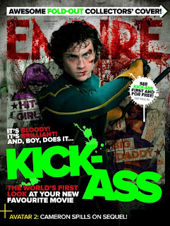
This is apparent as the colours used are green, black, white and red, this magazine is being unique by using four colours when usually magazines will stick to a three colours. The colours are bright, giving a striking and electrifying look. The red connotes energy and power which is essential for a film magazine as the audience will expect the magazine to be upbeat and dominating over other magazines but also highlights by bringing key information to the foreground amongst the image and text.
The use of white on the magazine contrasts well with red and represents positivity which suggests the magazine will give positive connotations and the audience will enjoy reading it but without the magazine they will feel negative and trapped away from the film news.
Contrasting well with the black this insinuates mystery and gives the magazine a proffesional and formal look. The use of black font such as 'see....first and for free' highlights part of the text but it doesnt reveal exactly what is inside which persuades the audience to buy it. Another major colour used is green which is restfull for the eye and is known to improve vision and stands out. But also green represents ambition, jealousy and growth which could display that the magazine aims to increase the growth of films by raising there popularity. But also it can be linked to jealousy because rival magazine companies if they see the name of the film featured in green striking out they could be jealous of the magazines success.
In terms of layout the title of the magazine has been used within the image which could suggest the magazine and film have now a connection and relationship, but also the magazine have made there mark on the extra success for the film with good recommendations and reviews. There is a lack of sell lines which does make the magazine look a little unproffesional but could also imply that the magazine is targetted at anyone rather than specific topics which would interest say just males. But also gives the magazine a competitive unique edge. Although there is a banner at the bottom of the page with some information 'Avatar 2: Cameron spills on the sequal' which grabs the eye of the reader and want them to see if the rumour is true . They made the writing 'Avatar 2' in yellow to make it stand out, but because the first movie was a bestseller the highlighting of the name could encourage the reader to buy it to find out if what is said is true.
There is also another banner at the top of the page which mentions 'awesome foldout collecters cover' which gives the audience a free gift and incentive to buy the magazine. The text is placed on an arrow pointing towards the end pages of the magazine which makes the magazine look fun and varied.
There is also use of taglines incorporated with the main headline. For example It's Bloody, It's Brilliant and boy, does it KICK ASS. The worlds first look at your new favourite movie. Which makes it look like the magazine is telling to reader a story and giving reviews before you even get to look inside the magazine. But this also gives some humour and wit to the magazine.
The image displayed in the magazine is of the new hit comedy movie kickass, which gives a fun and exciting twist to the magazine. The image is a medium shot of the character from the knees up, which lets us see his facial expressions clearer, but fills up the page more to give the audience the impression the magazine is jam packed full of information and pictures. His eyeline is placed in the top third of the frame which implies that he is dominant of the magazine and the main story but can also add to his facial expressions. His facial expressions are quite intimidating which could persuade people to buy the magazine or they will be missing out.
He has been placed in the centre of the frame to suggest he is the centre of attention and the main article is about him but could be the audience should be inspired by his success in starring in a hit movie. The actors body language gives a protective look also security which links to the films plot of superheros but could also suggest that the magazine will give you comfort and safety.
So overall I think the image dominates the magazine page to show what the main focus is and the taglines also gives the reader information on the main article. But also the magazine does lack in sell lines which doesnt reveal what else is in the magazine which could effect the appeal of the magazine. But the magazine does include some more headlines which can not be recognised as rumours or truth but there is only one way for the reader to find out! I should include some of these techniques such as the use of colour, unique images and maybe have a simplistic layout
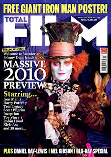
The main target audience for this magazine would be both males and females for older teens and adults. This is apparent in the use of colours purple, yellow and white. Purple represents royalty, ambition and extravagance, but purple is also known to be a popular pre-adolescent colour which will hopefully attract people to buy it as the colour stands out and appeals. Contrasting perfectly with the purple is the use of yellow. The colour yellow is associated with intellect and freshness which could sugges the magazine is up to date and always provides sufficient amount of information. However the colour white gives positive impressions and is the colour of perfection but it also contrasts well with the other two colours.
But the chosen colours in my opinion make the image stand out more as the image has quite orange, brown and salmon colours which is a greatly different contrast which could sugges the magazine aims to make the movies the main unique factor and subject of the magazine.
The actor Johnny Depp in the image has a smug and mischeiveious look on his face but also his eyes are set to look like he is staring at the audience crazily to fit in with his role but also possibly to encourage people to buy the magazine and they can feel comfortable letting go and showing there crazy side. The image being took at eyelevel as a medium close up, lets the audience only see the top half of his body. Johnny Depp plays took on the role of the madhatter this is reflected in his clothing, with the use of the variety of colours such as pink, brown and orange. His character is very flamboyant for example the crazy hair because of the way it sticks out and is very long suggesting he is a free spirit and doesnt care how he looks. He also has a very large top hat with could suggest he likes being noticed and on the hat is knitting needles which could suggest he made his clothing by himself but has pointless items with him at all times. The odd clothing and buttons gives him the mad look because he has lost his mind and cant tell what is correct and not. The use of hare as a prop is to signify the reason Alice ends up in wonderland as she follows the rabbit down the rabbit hole to enter wonderland, so this prop will give the audience clues to what the film is.
The background has been put in purple maybe to add to the magical theme and also adds to the mad hatter being childlike as purple appeals to children. But also in the background is an image of some gates, the impression I recieve is that the mad hatter is at the gates to meet the audience and take them through to the wonderful world of wonderland like Alice.
In terms of layout the use of the banner at the top of the magazine 'free Iron man 2 poster' gives the audience an incentive to buy the magazine to recieve a free gift, the text is in capitals and yellow font to alarm the audience that they shouldnt go without the magazine, and it helps promote there magazine with capitals to make it more noticed on a shelf. Also on the bottom of the page there is displaying the word 'plus' which makes the audience think they are getting more extras for there money but also gives them a sneak peak of whats to come.
The title 'film' is spread accross the page but doesnt cover the image this is good because the title can still be read due to it being white and standing out but also the image isnt ruined by being covered by text. The title is also in capital letters possibly to make it more memorable in someones mind.
The magazine has made use of the sell lines, but with only one storyline this is good as it will keep the rest of the stories a mystery and gives them more chance to promote the main story, in this case the 2010 movie previews is the main story featuring Johnny Depp and alice wonderland aswell as top films such as iron man 2, kick ass and Harry Potter. The 2010 previews was made in larger font to highlight it from the rest of the text and alert to the reader that they can find out the newest films around.


