Main title Logo

Reeltime Logo


This will be used as the main title for my overall trailer. It is simplistic and easy to read in a short space of time, I used a girly decorative font (dafont.com) which displays feminisity but also this has been placed saying 'Romeo' to give clues of what the narrative is about likewise with the 'Juliet' another font from (dafont.com) which displays a masculine look.
I put a simple font for the Vs in black so it is recognised on the logo and shows that the characters dont get along.
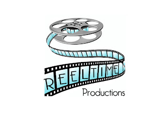
Reeltime Logo
This is the main production logo for my trailer, I found a movie reel online and used photoshop to edit the image to make it my own. I done this by using the gradient tool (blue and white) in the squares to give it a cool effect and modernised look but also it makes the image a lot brighter. I then used the wand tool and switched the colour to black, after selecting the parts I wanted I used the paint bucket to fill in the reel strip to make the image stronger rather than leaving it grey.
For the font I went onto a site called 'dafont.com' to download some fonts for the various logos, the font being called Bellerose this gives the image a professional look, I had to resize the different letters to fit them into the blue squares and displays the effect what old films used to have when they would display the different numbers on a film reel. (see example)
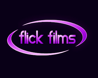
Flick films logo
Flick films is going to be the distribution company, I created there logo by starting off with a black background using the paint bucket tool. I then created the curved shape and used duplicate layer to get the exact same shape. To get one of the shapes to be upside down I used the transform tool to flip it horizontal and vertically. I then selected each shape individually and used the gradient tool with purple and white to give a faded effect.
For the title I went onto 'dafont.com' and found the font star avenue, I then used the gradient tool again to match the title with the shapes. For the shapes to fit around the type I used free transform to adjust the size and position of the shapes. The shapes weren't standing out very well so I used layerstyle to find improve it using outer glow by changing the colour to purple and experimenting with the size and noise creating a border/outline.
Movie house logos.

I have made two logos for Movie House as I was experimenting with the different filters and came across the lens flare which looked quite effective on a black background, so I created two versions and then I will put them both on Facebook for my focus group to decide.
The first image with the directors chair has also got a grey/black background so the spotlight is more noticable and makes the image stand out. I found the image of the directors chair online and did some editing to the image to make it my own by adding more colour to it and some text on the chair .
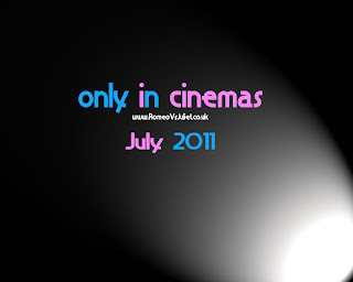
Only in cinemas logos.
I have done two variations on the only in cinemas logo, the first one being on a black background with a spotlight in the corner using the filters gives a professional but film like appearance but also helps highlights the importance of the information. The text is in blue and pink to add to the theme of bodyswap. I have also provided a date of the films release so this indicates to the audience to when they can see it. But also a website if they want to find out more about the film before seeing it.
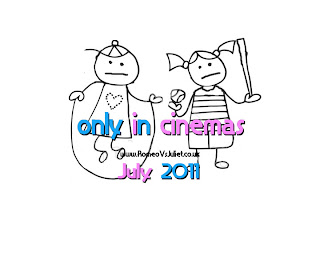
The second logo is on a white background with the same font as they first one so the body swap idea is still recognised. However there is an image on this logo, which looks like a childs drawing but the heads on the boy and girl have been swapped with upset faces which keeps the idea going and gives away what the trailer is about and can be used as a memorable image. I didn't colour the image as it may distract the audience from the information provided.
No comments:
Post a Comment